Exits: A Bold Isometric Display Font for Digital Impact
As a web designer who ships landing pages, SaaS dashboards, and conversion-focused online stores, I don’t reach for display fonts lightly. They need to earn their place—delivering structural clarity, brand resonance, and real-world readability—not just visual novelty. That’s why Exits stands out: it’s a premium isometric block font built for digital environments where hierarchy, tone, and spatial awareness matter.
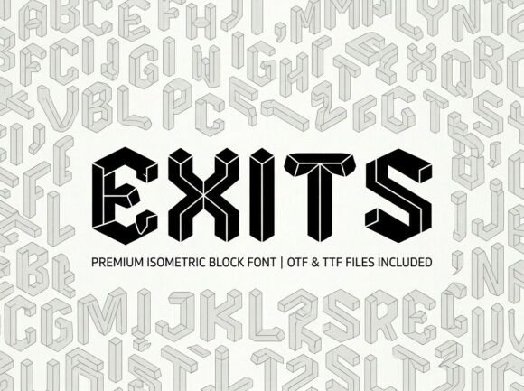
Exits renders letterforms with precise three-dimensional geometry—clean edges, consistent depth, and balanced weight distribution. Unlike stylized 3D fonts that sacrifice legibility for effect, Exits maintains sharp contrast and generous counters even at smaller sizes on screen. Its boldness isn’t arbitrary; it’s engineered for immediate recognition in hero sections, app onboarding screens, and banner ads where users scan in under two seconds.
In practice, Exits excels as a structural anchor. Use it for primary headlines, product name treatments, CTA buttons (“Get Started”, “Launch Now”), or section dividers like “Features”, “Pricing”, or “Testimonials”. It works especially well against solid-color backgrounds—dark mode interfaces, gradient overlays, or high-contrast image banners—because its isometric form creates natural visual separation without relying on shadows or outlines.
For responsive layouts, test Exits at 48px+ on desktop headers and scale down to 32–36px on tablet, 28px on mobile. Avoid using it below 24px for body text or dense UI labels—it’s not designed for extended reading. Instead, pair it intentionally: combine Exits with a neutral sans serif (like Inter, Manrope, or IBM Plex Sans) for body copy, navigation, and form fields. That pairing delivers both personality and performance—Exits sets the tone; your sans serif ensures clarity and accessibility.
Consider how Exits strengthens digital brand identity across touchpoints. A creative agency might use it for portfolio project titles and service headings—its architectural precision mirrors thoughtful design process. A boutique online store selling handmade ceramics or modular furniture gains instant cohesion when Exits appears on product cards, category banners, and email headers. For a coaching or course platform, Exits adds authority and forward motion to headlines like “Your Next Breakthrough Starts Here” or “Enroll Before [Date]”—its dimensional presence subtly signals growth, structure, and intentionality.
Readability on mobile is reliable—but only when used purposefully. On iOS and Android, Exits renders crisply with modern webfont loading (WOFF2 format supported). For dark-mode sites, ensure sufficient contrast: test against #121212 or #1a1a1a backgrounds using WCAG-compliant text color (e.g., #ffffff or #e0e0e0). On light backgrounds, avoid pure white (#ffffff) text over #ffffff—add subtle spacing or a hairline stroke if needed for definition. Never place Exits directly over busy imagery without a subtle overlay or text shadow; its geometry needs breathing room to read cleanly.
Font pairing matters more than ever in layered UIs. While Exits thrives alongside clean sans serifs, it also pairs surprisingly well with restrained serif fonts—think Playfair Display or Literata—for editorial blog headers or long-form course landing pages. That combination balances modern energy with timeless credibility. Avoid pairing Exits with other decorative or script fonts; its strong voice dominates. Save script or handwritten fonts for accent elements—signature lines, quote citations, or micro-interaction labels—where they complement rather than compete.
Exits ships with multiple weights (Light, Regular, Bold), true italics, and OpenType features including stylistic alternates and case-sensitive forms. Multilingual support covers Latin Extended-A, making it viable for English, Spanish, French, German, Portuguese, and many Eastern European markets. All webfont files are optimized for fast loading—no render-blocking delays when self-hosted or loaded via a reputable font service.
Licensing is straightforward but essential to clarify upfront. Exits is a commercial font: you’ll need a web license for any live site—even internal dashboards, client-facing portals, or password-protected course platforms. One license covers unlimited domains under a single business entity, including SaaS products, e-commerce stores (Shopify, WooCommerce), and digital templates sold on marketplaces. If you’re a freelancer embedding Exits into Figma UI kits or Notion templates for resale, confirm the license permits redistribution. Always verify file formats included—WOFF2, WOFF, EOT, and TTF—and whether variable font support is available for future-proofing.
Where Exits truly shines is in moments of decision. On a product landing page, it transforms “Try Free for 14 Days” from generic to grounded—its isometric weight implies substance, not flash. In an app onboarding flow, “Welcome to [Product]” feels intentional, not decorative. Even in minimalist contexts—a single-word logo lockup or a stark black-and-white testimonial banner—Exits communicates craftsmanship through form alone.
It’s not a font for every line of text. But for the lines that define first impressions, guide attention, and embody brand character? Exits delivers structural impact without sacrificing digital discipline. That balance—between boldness and usability, dimension and clarity—is rare. And in today’s crowded interface landscape, it’s exactly what makes a layout memorable, trustworthy, and conversion-ready.